how to design a logo for your business (with examples)
Wondering how to design a logo for your business? It’s a process that is not always easy to get right if you’ve never rebranded before. However, with some helpful guidance and some great logo design ideas, you should be able to come up with something that's just right.
Your company’s logo is an incredibly important thing to dedicate enough time and resources to. Not only will it be a customer’s first impression of your brand, but it will also be used across everything from your website and packaging to your custom merchandise and signage. So, when you’re in the workshop stage for a new logo, remember to strive towards five key attributes: make it simple, unique, versatile, memorable, and relevant (Finances Online).
To help you achieve your goals, this guide will look at what makes a good company logo design, as well as sharing logo design tips and ideas to get you started.
We'll cover:
Planning your logo design
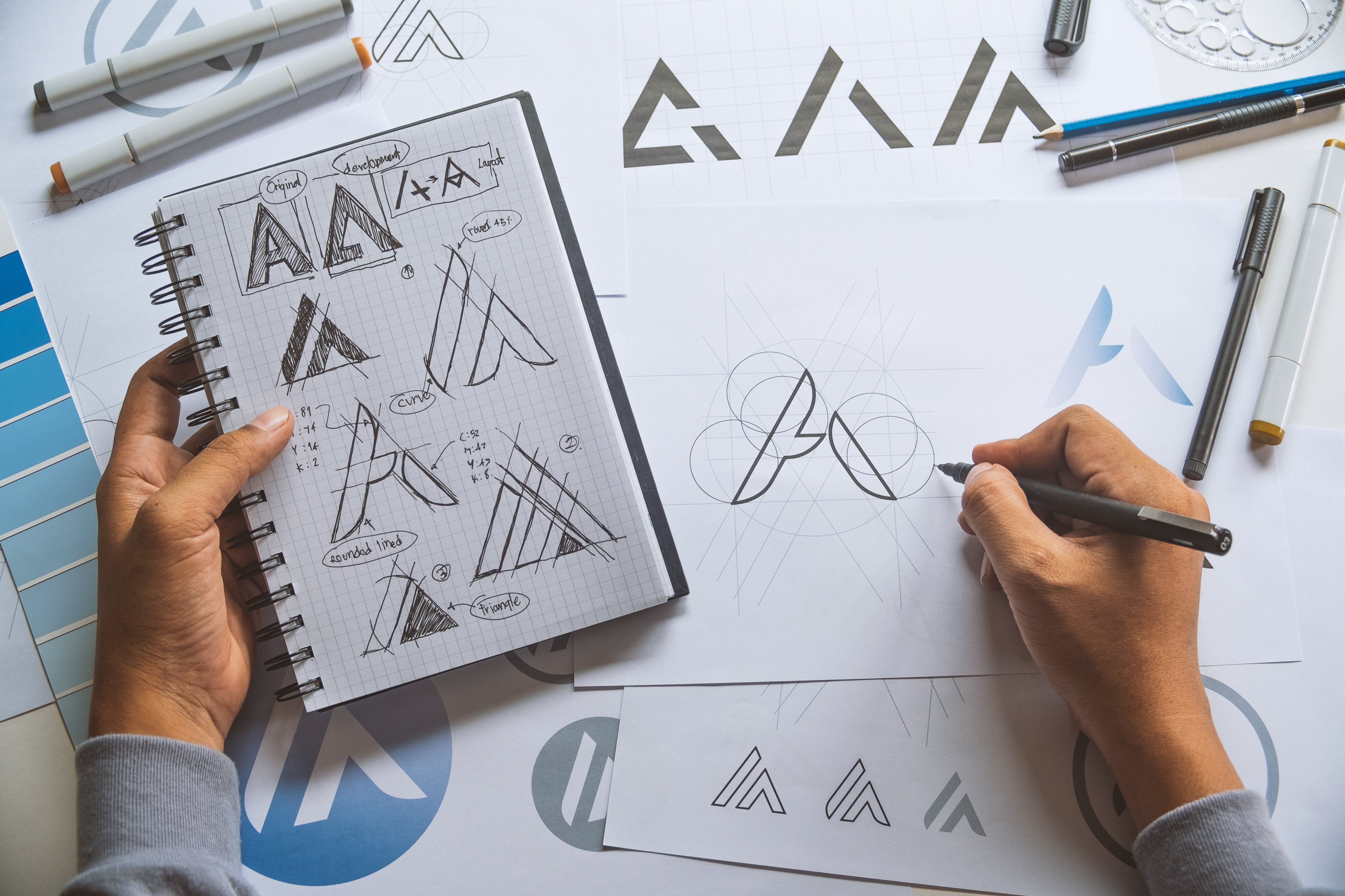
Creating something that is effective and iconic takes a lot of thought and planning. Your logo is one of the most recognisable elements of your brand, so it stands to reason that it should be distinctive and eye-catching, while being synonymous with the products or services that you offer.
As well as being a welcome relief among the sea of elaborate, eye-catching logos that consumers see every day, opting for a simple design has practical benefits too. For example, simplified logos can be more visually appealing when viewed on a mobile device, which is where most potential customers will conduct their online research and shopping experience. At a technical level, having fewer pixels to render can even mean a faster load time on your company’s website, which is an important factor in today’s fast-paced online environment. Finally, a simplified logo can be more versatile in terms of looking good at any scale, whether you’re making a large sign for your venue or creating custom merchandise like pens, keychains, sweatshirts, and more.
Behind the creation of every iconic logo is a period of intricate and detailed planning that lays the foundation for everything else to build upon. The very best designs take time to formulate and are often inspired by something unique. Below you will find some logo design tips for planning your project.
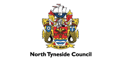
Find a story in your history

© BMW
When you're wondering how to design a logo, taking a deep dive into your brand's philosophy and history is a great place to begin. Does the founding of your company have any particular significance? Is there any product or service that you have unique ties too? Asking yourself questions like this could well lead to the meaningful company logo design you are looking for.
For a great example, take a look at vehicle manufacturer BMW’s logo. It has an iconic design that tells the story behind the company — the silver cross on a blue and white background represents their rich history in aviation, which saw them manufacturing plane engines during World War II. Not only is the design immediately recognisable, but it encapsulates the brand's history and heritage, too.
Carry out some market research

© GAP
Before you set about designing your logo, you need to know just what your company image is. You may think that you already have a good idea, but it can be worth carrying out a survey of your employees and customers, too. Getting a few extra opinions is always helpful, and you might just get a new insight into your brand that you want to either emphasise or move away from with the new design.
There is a good example of a firm not doing enough research before launching a re-branded design in the clothing manufacturer GAP. They tried to launch a new design of their classic blue and white image in 2010, only for it to be the subject of thousands of negative social media comments.
They subsequently switched back to their old logo, admitting they missed an opportunity to engage with public opinion before green-lighting the change. It just goes to show that a certain design can hold a lot of sway with people, and it is usually worth researching what they think before re-branding yourself.
Look around for inspiration
There is nothing wrong in admitting that you admire another company logo design, and it might just give you an idea of your own to work with. If you know of a competitor or another firm that has been around for a long time with much success, it’s worth taking a closer look at their brand image and logo to see what they have done right. Likewise, there may be good examples of where something hasn’t worked, which can give you some guidance too.
In saying this, we don’t mean that you should set out to copy any other firms, but there are certainly lessons that can be learned from good and bad logo designs.
Use the right tools to organise your ideas
When the ideas start to flood in, you might find it a little bit difficult to keep everything organised. By using tools such as mind maps and mood boards, you can keep everything pinned down so that you can consider the bigger picture.
Mind maps are a great technique for fully exploring an idea or topic, and you may find yourself linking concepts that you might never have considered otherwise. Mood boards are a great place to play with a multitude of inspiring items, giving you space to play with keywords, synonyms, colours, images, and much more in a single location. Many a eureka moment has been had while using these methods.
You might also want to explore some useful apps and online services. Pinterest is essentially an online mood board which can be used to organise digital sources of inspiration for future use. For keeping your notes all in one place where you or your team can access them, Evernote is a good choice. Using this, you can upload ideas to the cloud where they can be accessed from almost any device.
Create a logo design brief
Once you have decided on which direction you wish to go in with your project, you can then establish a business logo design brief for its completion. This should bring together all of the ideas that you have had that you think could inspire the design process.
Your logo design brief should include:
- A description of your business: Include details about your industry, your main products or services, your company’s unique selling points, your target market, and values or backstory.
- Logos that have inspired you: Give some examples of logos you really like and those you don’t. Choose ones that will be relevant to your business.
- Share any of your own ideas: These can be anything that you feel might inspire your design.
- The feelings you want your logo to convey.
- Any colours or fonts that you feel could work for your logo.
- Any plans you have for using your logo: Include each place that the logo will be used, such as your website, promotional merchandise, signs, and anything else.
If you are looking to hire a designer rather than go in-house, a good brief will play a key role in helping them to understand exactly what it is you are looking for from your company logo design.
How to find a graphic designer for your logo
Not every company has the capacity to create a high-quality, professional logo in-house, and that is where you may need to turn to a freelancer or a graphic design company. However, you need to make sure that you hire someone who will be able to successfully work with your company to produce a logo that you can proudly use.
There are a few things that you should consider before making your final decision:
- Their track record: Does the designer you have in mind have a good history of creating quality logos for other companies? Do they have experience of working in your sector?
- Their portfolio: Take note of the ratio between real and conceptual logos. Does the portfolio feel padded out with mediocre designs? What is the general quality?
- Testimonials for their work: While many designers will list testimonials on their website, it’s often best to check with their clients to verify them, provided they are not competitors. Their LinkedIn page is also a good place to see who they have worked with in the past.
- Recognition: Has any of their work been published anywhere of note or won any awards?
- Time taken: How long will it take them to design your logo? A one- or two-day turnaround is often a sign of a rushed job, while you don’t want the process taking months and months. A good balance to be expected would be one to two weeks.
- Price: Not a key indicator, but a cheap rate can be a sign of a quick job or someone who is inexperienced and eager for business.
- How they carry themselves: Do they respond to queries promptly? Are they professional in their communications? Do they have a clear plan for the design process? These are often indicators of who treats their work seriously.
- Their level of interest: A good designer will ask questions about your brand to make sure they have covered all of the angles for your design. This is also a sign of their dedication to the project.
Reviewing the above points will give you a good checklist to work through when it comes to choosing a designer to suit your business logo design project.
Logo design ideas and tips for your business
Below, we’ve set out some logo design ideas and tips to consider. While there are certainly no set rules for logo design, they should help to inspire you in the creative process.
Simple designs are often the best
One of the golden rules of good logo design is the KISS methodology, otherwise known as ‘Keep It Simple, Stupid’, which is based on the idea that people recognise and remember simple logos more so than those that are complex.
Branding company Siegel + Gale carried out a study into the topic and discovered that respondents found the most memorable logos to be simple. They also asked people to name and describe the logos that they thought were the most recognisable — the top four were Nike (16%), Apple (15.6%), McDonald’s (11.1%), and Coca-Cola (9.7%), all of which have some of the simplest designs out there.
A great way to rid potential designs of superfluous elements is to employ You can do this by asking yourself whether certain parts of your ideas make sense or match the brief, or if you really need to include them. If the answer is no, then they probably aren't necessary.
With this in mind, it's often the best decision to go with a logo that you feel represents your company well, without being overly complex or confusing.
To help keep your logo as simple as possible, you may avoid incorporating any illustrations altogether and just focus on finding the right typeface to display your brand name. One way of doing so (while still adding some interest to the logo) is by connecting type through guided lines or basic shapes like circles or squares. This can provide some structure, giving the logo a spine or an anchor it may have been lacking (Adobe Express).
You may also choose to use the text as its own form of illustration, by playing around with the composition of your brand name. This might involve creating an arch, circle, or tombstone shape with the letters, either to surround a small illustration or to be a form of embellishment in itself. This tends to look great on branded merchandise like clothing or takeaway food packaging. Blending together different fonts can sometimes be enough to spice up your logo without any decorative elements, but it’s best to stick to two fonts if you still want to keep things simple and clear. People are less likely to remember your brand if they can’t read what your logo says!
If you feel your logo needs something a little more unique, a tried and tested way of keeping things minimalistic is by incorporating single-line drawings. This way you can give customers a clearer idea of what your business does with just a few strokes, such as a sketched pair of scissors for an independent salon or a simple wave to signify a surf school.
Think outside of the box
There is always chance that you might fall into the trap of using some clichéd and obvious ideas — for example, logos incorporating globes to represent an international company or speech bubbles to represent messaging services. The problem with these concepts is that, while they represent the brand perfectly well, they widely used and therefore considered generic. And, if your company logo design looks like everyone else's you'll struggle to build brand recognition.
Instead of being trapped by clichés, try to think outside of the box and make some innovative design choices when it comes to your logo. Try out some different images or fonts and you might be surprised with how good they actually look, giving you something unique. If you are determined to work what you fear might be an overused element into your logo, try to incorporate it in a different way to separate yourself from the crowd.
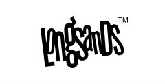
One logo trend that’s currently having a resurgence is the sketch or scribble aesthetic. These imperfect drawings and handwritten designs are a departure from the bold, corporate feel of many traditional logos popular in recent years. This informal, stripped-back aesthetic can communicate an ethos of authenticity from the brand to the consumer, which is something that resonates with — and can even be endearing to — younger demographics like millennials and Gen-Z.
In fact, IBM’s report with the National Retail Foundation confirmed that as Gen-Z has grown up in the era of the internet and ‘fake news’, they are more suspicious of traditional marketing techniques. Instead, this generation looks for brands that feel authentic, transparent, and trustworthy. So, if you are passionate about upholding and communicating the values of your company — such as sustainability or conservation — you can use a stripped-back, rustic logo design to convey this from the very first impression.
Use colour to enhance your logo
Colours are able to affect our emotions when we look at them, which makes their use in your logo important. Because of this, it is vitally important to get them right to elicit the right response from a potential customer.
While you might be limited to the brand colours of your company, if you have the freedom of choice, you should choose a scheme that suits the target demographic of your customer base. Consider such factors as the age, gender, or culture of your clientele, as this can affect your final decision. For example, if your business primarily deals with older clients, the bright, zany shades of yellow and orange that might appeal to children probably won’t be suitable.
Also, the products or services that you offer may influence your choice of colour. A company that specialises in recycled goods will probably want to incorporate one or more types of green, while a chain of fast food restaurants might want to use the reds, whites, and golds that represent their industry.
There is a whole field of colour psychology to explore out there too, based upon the premise that colours make us feel and react in different ways. How much you buy into them is up to you, but there is certainly much to consider if you want to tailor your logo towards these theories.
Make sure your logo is versatile

If you are planning on using your logo across a few different applications, it will need to be versatile so that it looks the part. For instance, if you plan to update the company website, take out a full-page print advert, and have it embroidered on staff uniforms, you will need a logo that can be adapted to each purpose. Different colours and sizing are both variables that your logo will need to deal with at some point or another, so it’s important to take this into account at the design stage.
Additionally, a company logo design that can be altered easily can save you money, as you do not have to spend funds on multiple versions or time having to change it yourself.
There are a few of things you can do to make your design as adaptable as possible:
- Use a vector format: This will ensure that your logo can be resized without looking stretched or pixelated, which will mean it can be used across a variety of sizes.
- Use only black and white: Though this might not be your final goal as you want to use colour, working in monochrome allows you to focus on the concept and shape of the logo early in the design stage. It will also make sure that it looks good when printed in black and white, which can save you money in large print runs.
- Use negative space efficiently: Getting the balance between white space and the elements of your logo is important, as if it is too narrow it may not translate well to print. On the other hand, too wide of a space can create a disjointed effect, often making it less recognisable.
- Use gradients sparingly: If you overuse gradients, such as tints, you risk spoiling the effect when your logo is printed. Light tints often don’t show properly, while dark tints can appear too muddy.
Choose a timeless design over a trend
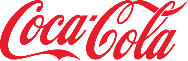
Like many fields, logo design is subject to trends that will see many people adopt a particular style for their branding, only to cast it aside when tastes shift. However, some of the most recognisable logos in the world have been around for ages, remaining virtually unchanged for decades. This is a testament to the success of these logos’ designs, proving themselves to be completely timeless in spite of shifting trends in brand image. A great example of one of these logos is the iconic, cursive script Coca-Cola branding, which is as memorable today as it was when it was first developed in 1885.
You can avoid the pitfalls of chasing an on-trend logo by opting for a timeless logo from the outset, which will be a fantastic direction to take for your own project. Even if you don’t quite make it to the hundred-year-old heritage of the Coca-Cola branding, following a similar process as these classics will leave you with a company logo design that shares many of their strong hallmarks.
While they may not be traditionally minimalist or simplistic, it’s worth noting that logos with a nostalgic design are also proving to be hugely popular with the Gen-Z demographic. In particular, the Y2K aesthetic (using shapes, colours, and fonts inspired by the late nineties and early noughties) has taken the fashion and design industries by storm in recent years. In terms of logo design, this often translates to playful, pastel colours and typography that reminds customers of old-school posters or teen magazines.
Despite their curated, on-trend design, these nostalgic logos can still be seen as simplified because, for Gen-Z, they hark back to a simpler and arguably more optimistic time that intrigues them. So, whether you opt for a fun Y2K aesthetic or a muted ‘70s colour palette, a retro logo can attract today’s young adults and help set you apart from competitors with corporate, ultra-modern logos.
Aim for an image that follows many of the guidelines that we’ve mentioned: simple shape, no complex graphical elements, no gradients, and a limited colour palette. Adopt an outlook in which you treat each part of the logo as its own stand-alone piece, where the font, outline, and image can be recognised individually as part of your branding.
Creating your new brand with Custom Planet
Now that you know how to design a logo for your business, you can start thinking about implementing it into your brand. Here at Custom Planet, we can help you achieve your goals when the time comes to roll out your new company logo. Our expert team of printing and embroidery specialists can work with you to apply your logo to a whole range of quality clothing, accessories, and merchandise once you have finalised your design.
We’re able to employ the latest digital and screen printing techniques, as well as our high-quality embroidery service, to ensure your logo takes pride of place on any of the clothing items you order. We also have the capacity to add multiple garment finishes, such as neck labels, hem or sleeve tags, and swing tags. So, if you’re looking for branded safetywear, workwear, or hospitality wear with your company logo design, we can help.
We are also your one-stop shop for promotional products featuring your logo, ideal as corporate gifts or event giveaways to get your company name out there. There is a whole variety of merchandise available, including pens and bags. We can also provide you with a choice of custom conference products, ideal if you are exhibiting at a trade show.
We hope that this guide helps you to create a logo that is just right for your brand. If you have any questions or would like more information, don’t hesitate to get in touch or give us a call on 0191 597 2668.